Chit Chat


CHIT CHAT CASE STUDY

CHITCHAT: A CHAT APPLICATION FOR PEOPLE WHO CAN SPEAK AND WRITE MANY LANGUAGES USING DIFFERENT ALPHABETS.

Brief

In our times, mobile chat applications are very useful, as they help us stay connected with people we need in a timely manner. Statistics show that WhatsApp announced more than 1.5 billion monthly active users as of December 2018, that’s a lot!

However, most of those chat apps have inconveniences that users experience and it’s difficult to find the solutions to solve these inconveniences.

The Challenge

Reducing time and frustration for people who use mobile chat apps for chatting in multiple languages at the same time with different users, especially languages with different alphabets. Autocorrect does not switch automatically depending on the language when person starts typing in different languages at the same time, in different chat windows, making them type words and sentences twice or more.

The Proposal

Add a feature to the chat apps, such as WhatsApp, Skype, Line or Facebook making it possible to select the language/alphabet user wishes to use when chatting to a particular user or users, enabling chat in different languages with different users at the same time with autocorrect working for the language chosen.

The Goal

Design an app that helps users to adapt the language and autocorrect to particular users in the chat.

My Role

This is a solo project I built while studyin in the Interaction Design Foundation, for the course: Become a UX Designer From Scratch.
My Design Process

I decided to follow IDEO’s Design Thinking Process and the SCAMPER method to generate ideas and make sure that my design decisions were properly supported

Persona

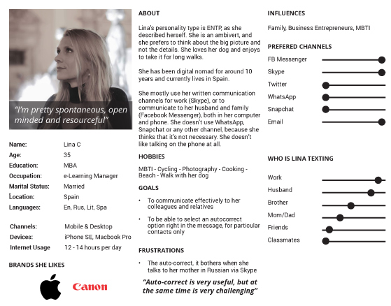
My target group is people in their mid 30’s and professionals, who speak more than 3 languages. I interviewed two women, Lina and Jennifer. They have very different personalities. Lina mostly uses her written communication at work (Skype), or to chat to her husband and family (Facebook Messenger). Jenny is very social and active on different social media platforms to communicate – she uses WhatsApp most of the time, as she participates in many WhatsApp groups. She seeks fun in using her mobile chat apps. They both are very tech savvy and they understand how to use their phones properly.

In this case study, I’m presenting Lina’s persona.

User Persona

Ideation

I used the SCAMPER method to focus my thinking, and to decide what are the most important aspects of the app. I found potential solutions to solve the current way of texting with the help of these insights.

1. Plot

The goal is to design an app that helps users to adapt the language of the autocorrect to particular users in the chat.

2. Character

Our character is a person who can speak and write more than 1 language, per example, they can speak some Latin and some Arabic or Slavic languages, they are highly educated, they work as project managers, software developers, visual designers. They usually work in a foreign countries and some of them are digital nomads far from their families.

3. Theme

I see people having problems writing in another language than their phone’s setup. This app will help users to communicate effectively by switching to the desired alphabet to chat at the moment of the conversation.

4. Dialogue

When I see these people writing on the phone and the autocorrect messes their communication, I can see that they look angry and frustrated, they need to rewrite everything from scratch, and possibly do it multiple times.

“arghhh this is ridiculous, I can’t believe it, stupid phone!!”

“Why I can’t just choose the language I want to write in the same window for just this user?”

5. Melody/Chorus

OMG how to deal with such a mess, time is ticking. This app must solve the problem.

“arghhh this is ridiculous, I can’t believe it, stupid phone!!”

“Why I can’t just choose the language I want to write in the same window for just this user?”

6. Décor

These people work from modern offices, home, coffee shops, pubs, or co-working spaces, it doesn’t matter the place as soon they have a reliable internet connection.

7. Spectacle

This issue can make people try different apps to see which one works better for them, and this will improve their way of communication via mobile chat apps.


Design Principles

After my research and user interviews, I have come up with design considerations to apply while brainstorming.

1. Simple

Users who are familiar with any mobile chat app will not encounter any problem using it, there are is need to learn a new skill.

2. Integration

Users will have the option to choose the alphabet without any complicated steps.

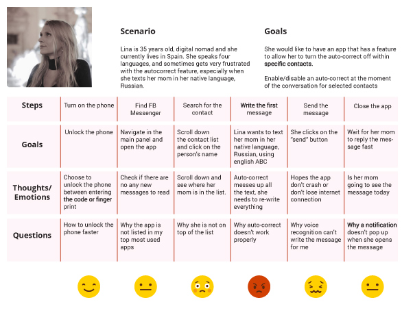
Journey Map

Journey Map

3. Brand Colors

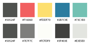
Bells are usually of yellow/golden color, and I wanted to use yellow as a main color. In color psychology, this color represents optimism, confidence, self-esteem, extraversion, emotional strength, friendliness, creativity and more.

As a designer, I know that yellow goes well with black and red, and that I could use different shades of grey for the background.

Brand Colors

4. User Flowchart Map

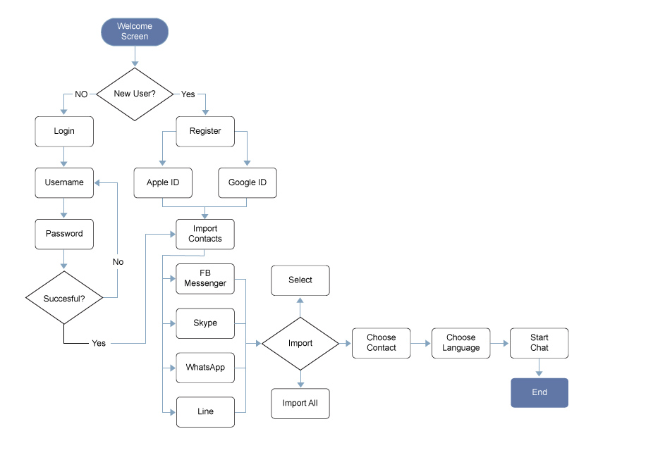
This flowchart shows the process of how to start importing the contacts and setting up the alphabet which the user will be using to communicate to a specific person

User Flowchart

5. Paper Prototype

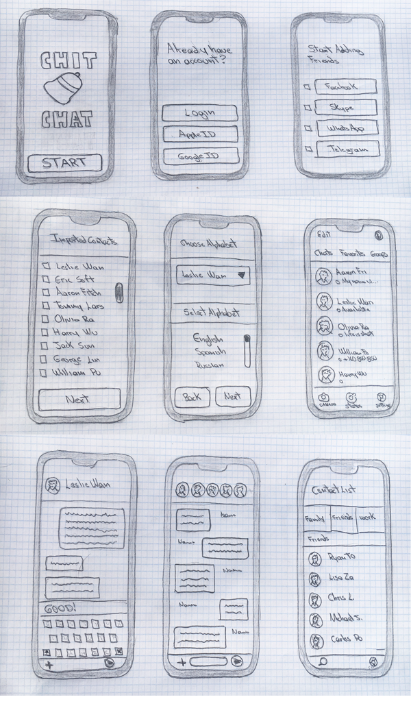
Based on my research, I worked on the concept to layout the app on portrait view, since this is already a common way for chatting. And also this mode allows sufficient space to showcase a big part of the conversations.

Low Fidelity Wireframe

6. High Fidelity Wireframe

Based on my research, I work on the concept to layout the app on portrait view, since this is an already a common way for chatting, and also this mode allows sufficient space to showcase a big part of the conversations.

This prototype was made using Figma.


The Recap

What did I learn?

As my first mobile app design, this has been a challenging and rewarding journey. I learned that the autocorrect feature is very helpful but at the same time people get frustrated about it when writing in different languages.

As expected, the biggest challenge for this app will be to override the phone’s language/alphabet settings to be able to change them when needed; as well, to import the contacts from different social networks.

The intention of this app is to allow users to configure the alphabet as they wish depending on their contact and language, as well to compete with the different mobile chat apps we currently have in the market.

I understood the needs of the users through interviews, and finally, I faced the challenge of creating an engaging app both from the user experience perspective and the visual perspective.