Renowal License Form


Massachusetts Driver’s License Renewal

A form application to easily help Massachusetts drivers to renew, replace or change address on their driver’s license.s

Brief

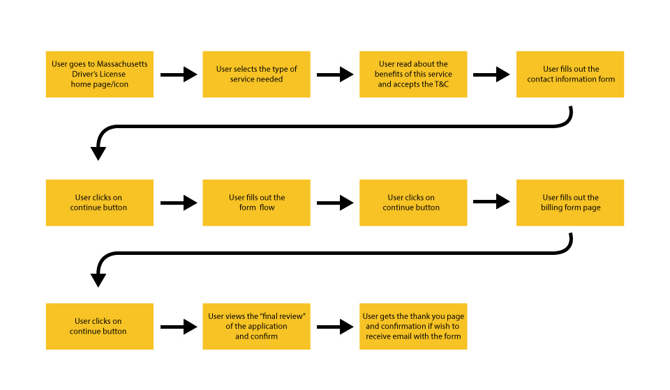
How many people enjoy filling out the forms? I think, not too many. People don’t want to commute to the offices and spend their limited time waiting in lines, that’s why nowadays it’s very helpful and time saving to have an opportunity to complete their task online. Users wants to take advantange of the technology. The purpose of this application is to help users easily get or renew their documents which are shipped to their home by filling out a form without any struggles or time expenses.

The Goal

Help the Massachusetts Driver’s License office to reduce the amount of users, lines and waiting time in their office; as well as customer service expenses by creating a form that is fast to fill in and easy to understand, with just the essentials fields.

My Role

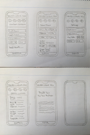
This is a solo project I completed in 3 days in order to help myself to become more experienced UX/UI designer.

The Problem

The current app is outdated and not user friendly enough. Massachusetts Driver’s License office employees are getting a lot of calls from people complaining about the system and how difficult is to renew the license online.


My Design Process

I decided to follow IDEO’s Design Thinking Process to generate ideas and make sure that my design decisions were properly supported

Persona

The target group is men and women older than 18 years of age who need to renew, replace of change the address on their driver’s license. They have different personalities and different computer skills. 72.46% users preffer completing this task on mobile againts 23.23% of users preffering desktop computers.

User Persona

Design Principles

1. Simple

People who have some experience using their mobile phones shouldn’t have any problems filling out the form, new skills are not required

2. Brand Colors

Our character is a person who can speak and write more than 1 language, per example, they can speak some Latin and some Arabic or Slavic languages, they are highly educated, they work as project managers, software developers, visual designers. They usually work in a foreign countries and some of them are digital nomads far from their families.

color palette

3. User Flowchart Map

Having aforementioned audience pain points in mind, I’ve created a user task flow that would simplify the process and just have a few clear steps.

User flow

4. Paper Prototype

When I see these people writing on the phone and the autocorrect messes their communication, I can see that they look angry and frustrated, they need to rewrite everything from scratch, and possibly do it multiple times.

“arghhh this is ridiculous, I can’t believe it, stupid phone!!”

“Why I can’t just choose the language I want to write in the same window for just this user?”

User flow

5. High Fidelity Wireframe

This prototype was made using Sketch. You can click on the Youtube video below, or if you prefer to navigate thru the prototype, please click on the following links:


Conclusion

What did I learn?

Making it feel simple and familiar is the key – and thinking from this perspective allowed me to organize the fields in a simple, readable and intuitive way as the core features of a positive user experience.